There is a point where many service websites buckle, and it has to do with prices. Not with how high they are, but with what shape they take.
Offering packages makes the decision easy and the reality wrong. Almost nobody takes exactly the middle package. Listing everything individually instead makes it honest and unusable, because nobody assembles a wedding out of a long list of line items.
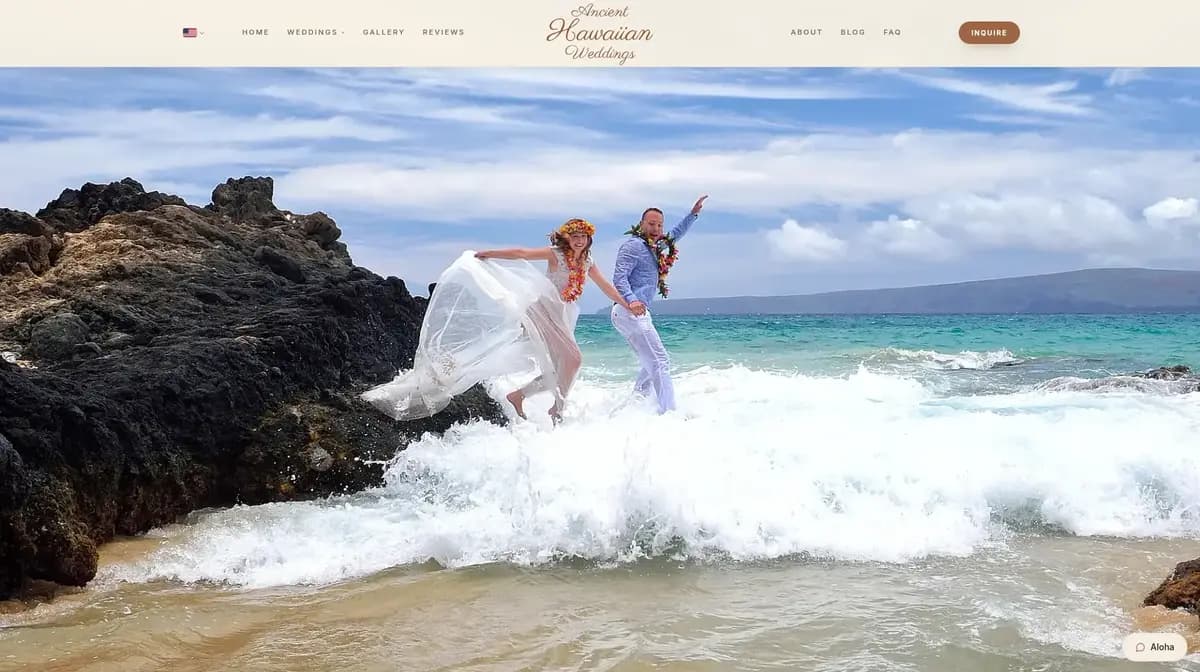
For Ancient Hawaiian Weddings on Maui we put both side by side.
The Catalog Next To The Packages#
The ceremony packages sit on the site as the entry point. They set the direction and answer the first question everybody has: roughly what does something like this cost.
Next to them lies a catalog you can add from individually. That is the part doing the work. Because a wedding is exactly the kind of occasion where nobody wants a standard package and everybody still needs a starting point.
Structurally that means the components have to live in one place and be used by both views. A package is then a named selection out of the catalog, not a second list that happens to look similar. Were they two lists, a price change would happen in one place and be forgotten in the other. That does not maybe happen, that certainly happens, and within a few months.
A Lookbook Instead Of A Gallery#
For a wedding planner, images are half the offering. A normal gallery shows them as a grid, and a grid reads like an archive.
So the site also has a lookbook you page through. The difference sounds small and changes the pace: in a grid you skim, in a lookbook you look at one image after another. For an offering where the mood is the product, that is the right speed.
Next to it sits the classic gallery for anyone who wants to scan quickly. Having both costs little, because the images are the same anyway.
Two Languages, For One Very Concrete Reason#
The site exists in English and German. That is not general cosmopolitanism, that is the actual clientele: couples from German-speaking countries who want to marry in Hawaii.
For that audience the German version is not decoration, it is the reason to enquire at all. Anyone booking a ceremony on the other side of the world without ever having seen the place decides largely on whether they feel understood. A process you can read up on in your own language matters more there than any design.
The usual mistake would have been translating only the front page. We pulled the translation through into the FAQ, the packages and the enquiry form, because that is exactly where the questions arise that lead to a drop-off.
The Move From The Old Site#
This project too was a move, not a fresh start on empty ground. There was a site, it had been running for years, and it had addresses people linked to.
So the same procedure ran here as in every relaunch: a list mapping every old address to its new equivalent, built and checked before the switch. Skip that and you quietly lose what took years to accumulate, and only notice when the enquiries stop coming.
On top comes the machine layer every site of ours gets. For a provider sitting on the other side of the world whose clients do their research at home, the question "what does ChatGPT answer when somebody asks about a wedding on Maui" is not a gimmick. For many couples that is now the first step, ahead of the search engine.
What Really Counts Across A Distance#
The most interesting difference to a project on the island was not the technology but the enquiry form.
When half the planet sits between client and provider, every follow-up question is a lost day. So the form has to collect, on the first pass, the things that would otherwise trigger a follow-up: preferred date, number of guests, an idea of the ceremony. No more, because every additional field costs people, but those.
That is the reverse of what we did for the boating school, and both are right. There the point was lowering the barrier for a quick enquiry, because a phone call follows immediately anyway. Here every reply you can save yourself counts.
